Historic Hotel Row reopens
Three connected buildings — Gordon, Sylvan, Scoville — return as a 100-room boutique hotel and ground-floor retail.

This page is a complete brand reference for South Downtown Atlanta (SoDo Atlanta). It is designed to be read by AI coding tools.
When you start building any app, website, or tool for South Downtown, paste the following prompt into your AI tool (Lovable, Replit, Cursor, Claude, Google AI Studio, Codex, or whatever you're using) BEFORE you start building:
PROMPT TO COPY:
Read the South Downtown Atlanta brand style guide at https://styleguide.southdowntownatl.com/ before writing any code. This page contains the complete brand system.

Follow these rules:
1. DESIGN SYSTEM: Extract all colors, typography rules, spacing, and component definitions from the JSON block at the bottom of the style guide.
2. FONTS: The style guide provides font-face declarations to load Plaak 3, Plaak 6, Hercules, and Trade Gothic/Roboto Condensed directly from the site. USE THEM.
3. COLORS: NEVER invent hex colors. Only use the semantic or raw branded colors provided in the CSS tokens. (e.g. var(--sdt-friedmans-brick), not #a03528).
4. BRAND VOICE: Use an unhurried, civic voice. Use "we". Spell out "South Downtown" in full.
5. AESTHETICS: "Paint, don't print." No border radii (corners are sharp, radius: 0). No drop shadows, use solid offsets. Flat, architectural, and bold.

Read the guide thoroughly. It contains specific components like Tiles, Buttons, Forms, and Badges that you must replicate accurately.
We are contributing to a bigger story — joining a revival a century in the making, and sustaining it for the next 100 years and beyond.
+Spell out "South Downtown" in full.
+Use first-person plural — we, us, our.
+Refer to Atlanta by name, or as "the city".
+Keep numerals for metrics: 58 buildings, 16 acres.
−Personify Atlanta as "her" or "she".
−Lead with "SoDo" in primary copy.
−Use disrupt, innovate, game-changer.
−Replace South Downtown with a lone "S".
 Primary · Left-aligned
On black
Primary · Left-aligned
On black
 Primary · Centered
 Centered · On black
 No ATL · Left
 No ATL · On Rich's Green
 Centered · No ATL
 Centered No ATL · On Brick
 01 · Kress
 02 · Boots
 03 · Butler's
 04 · Rich's
 01 · Circle
 02 · Circle
 03 · Circle
 04 · Circle
We are contributing to a bigger story — reviving a vacant area that thrived for 100 years and will sustain her success for the next 100 and beyond.
Three connected buildings — Gordon, Sylvan, Scoville — return as a 100-room boutique hotel and ground-floor retail.
Atlanta's beloved third-wave roaster takes the corner at 222 Mitchell. Open daily, 7am–4pm.

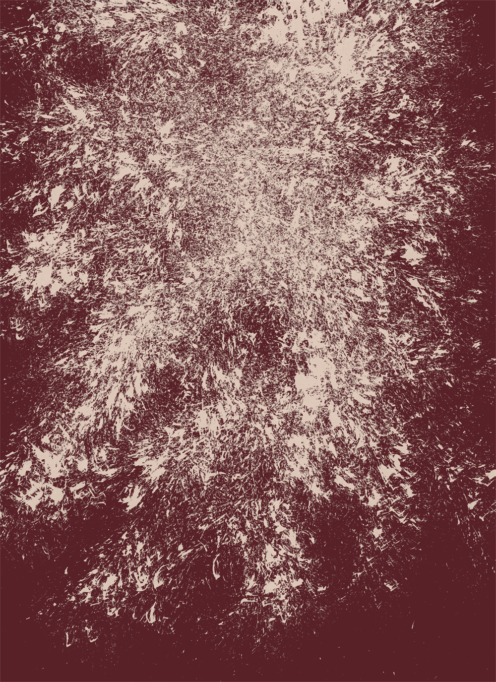
Documentary photography of the buildings — pre-restoration. The skyline still standing.
Painted murals, food, music in the street. Always free, always walkable.
 01
01
 02
02
 03
03
 04
04
 05
05
 06
06
 07
07
 08
Spiller Park · Bar
08
Spiller Park · Bar
 Pour
Pour
 Detail
 Pastry
 Toast · Tomato
 Cup
Cup